Final UI Refinements – Bringing Dolven to Life
If you read my first article about the 5 principles I learned making Dolven Runes Gambit, those five principles became the foundation for everything that followed. They shaped how I approached every decision, every layout, and every revision of the cards.
But understanding the principles was only half the journey. Applying them consistently, across an entire system was where the real work began.
In this article, I take that next step. Moving beyond theory into practice, I walk through how those ideas were refined, tested, and ultimately brought together into a cohesive visual system.
From Function to Clarity
Early on, the cards worked. All the information was there. Every mechanic was technically represented.
But that wasn’t enough.
Players hesitated. They reread effects. They missed key values. The issue wasn’t the system it was how the system was being communicated.
The shift came when the focus moved from: “Does the card contain the right information?” to “Can the player understand it instantly?” That change in mindset drove every refinement that followed.
Refining the Visual Hierarchy
One of the biggest improvements came from reinforcing a clear visual hierarchy.
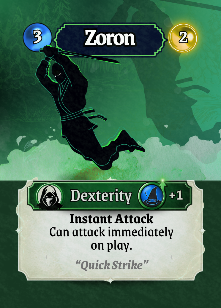
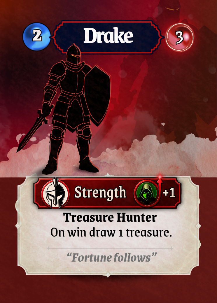
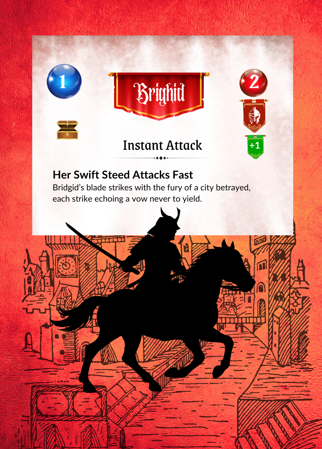
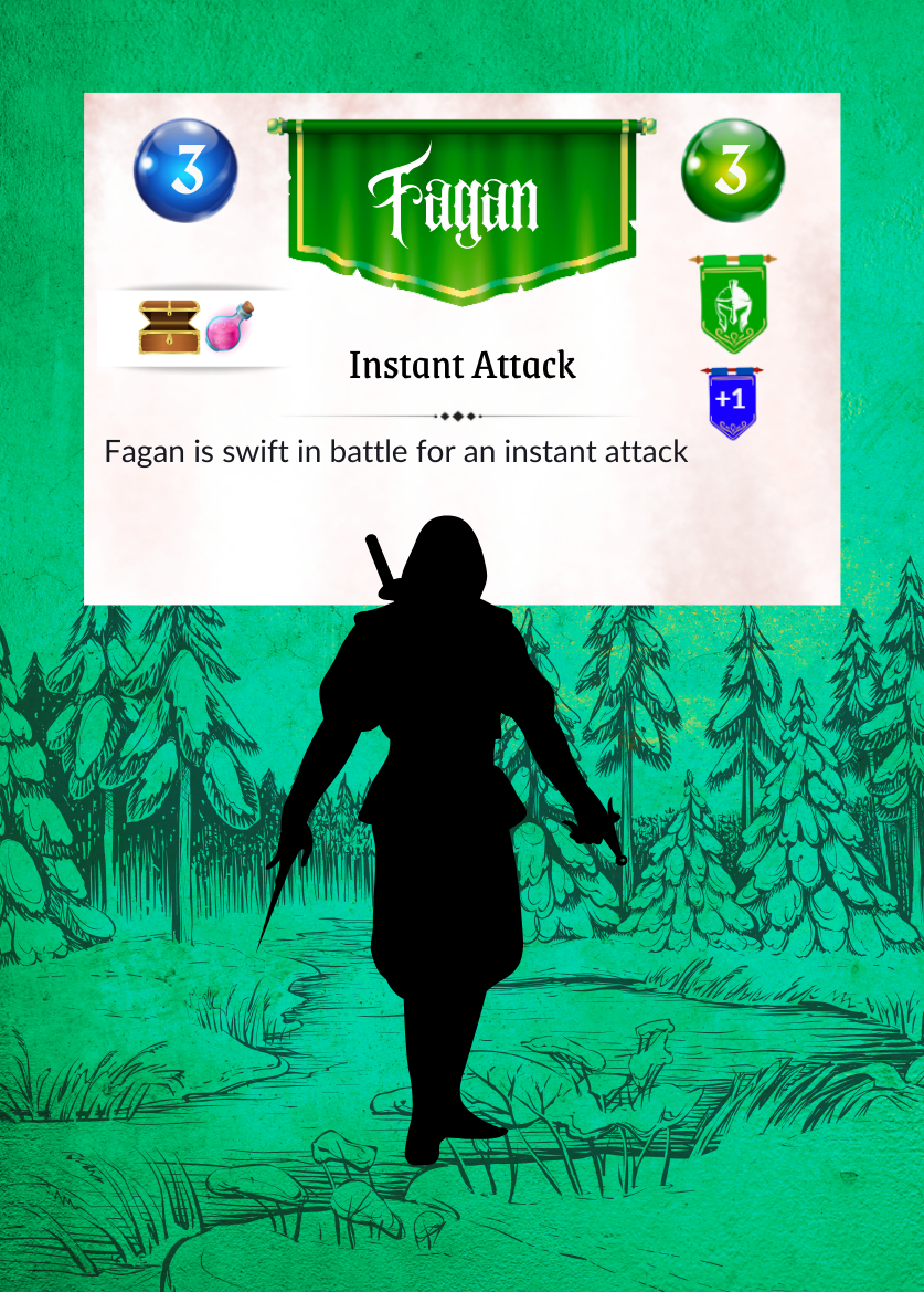
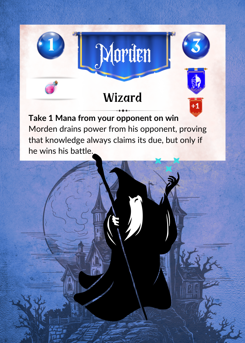
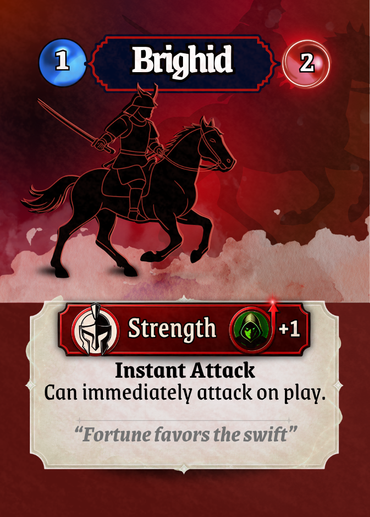
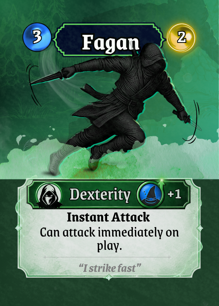
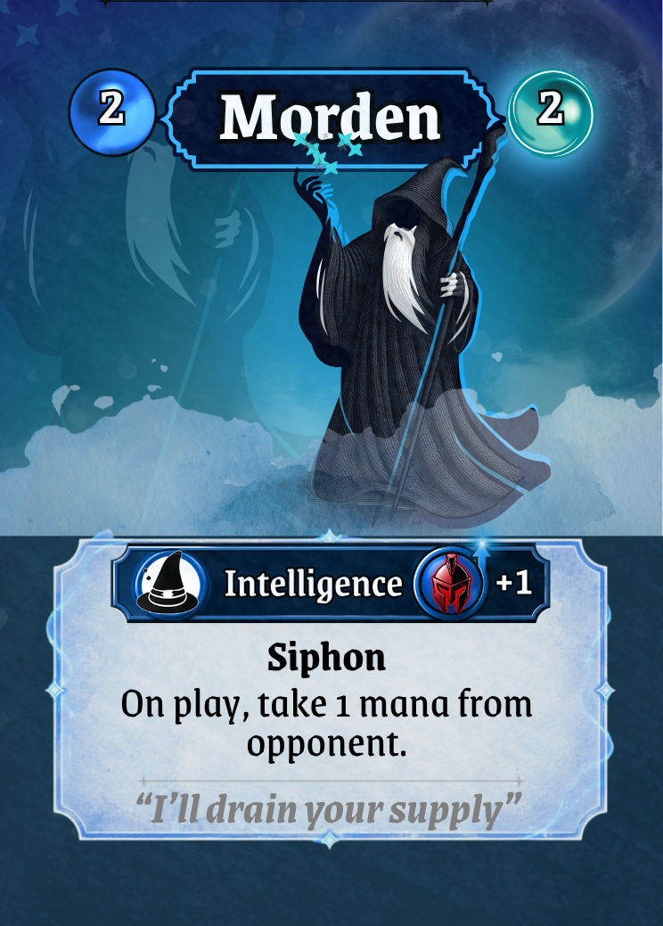
Each card now follows a consistent structure:
Top section establishes identity (name, rune value)
Artwork provides theme and recognition
Banner communicates archetype and relationships
Text panel delivers gameplay information clearly
By committing to this structure across every card, players no longer need to “learn” each design individually. The layout teaches itself.

Before vs After – Visual Hierarchy
Before:
Text and icons competed for attention
No clear focal point
Important information was easy to miss
After:
Clear reading order from top to bottom
Strong emphasis on key gameplay elements
Supporting details fade into the background
The result is a card that can be understood at a glance, even during play.
Reducing Noise, Not Information
Another key lesson was that clarity doesn’t come from adding more, it comes from removing what isn’t needed.
Earlier versions of the cards tried to:
Label everything
Explain every interaction
Fill every available space
This created friction. The refined approach focused on:
Letting icons replace repeated text
Standardising ability wording
Removing anything that didn’t directly support gameplay
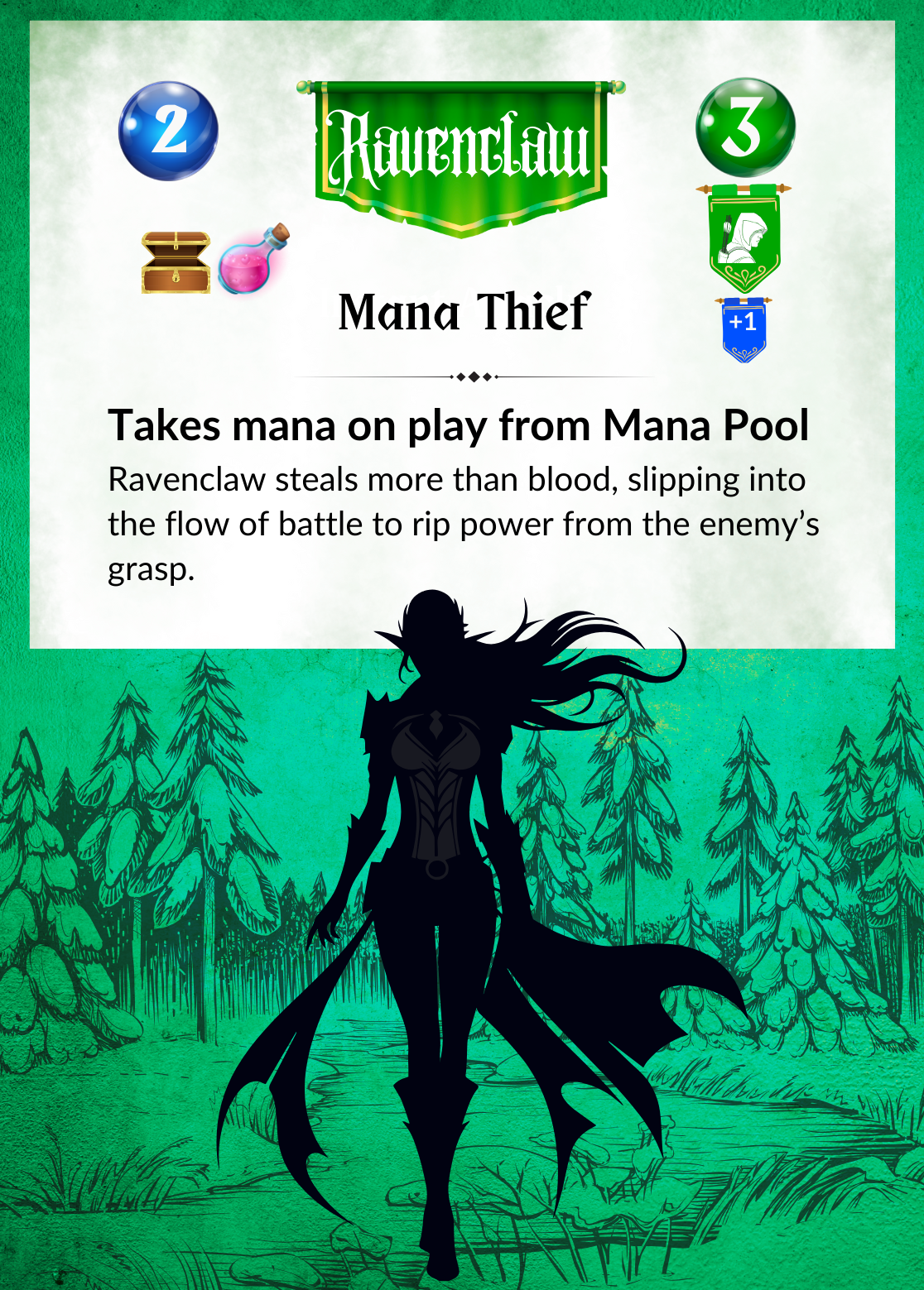
Before vs After – Ravenclaw - Information Density
Before: Heavy text blocks, Redundant labels (e.g. repeated archetype names) Visual clutter that slowed down reading
After: Short, consistent ability text, Symbols doing the work of explanation, Cleaner layouts with breathing room
Players can spend less time reading and more time playing.
Material Feel and Micro-Refinement
Once the structure was solid, the focus shifted to polish.
This is where small changes had a big impact:
Subtle microtextures added a tactile, physical feel
Softer transitions between artwork and text panels removed harsh visual breaks
Slight gradients and highlights gave elements depth without adding noise
These refinements are easy to overlook individually, but together they elevate the cards from flat designs to something that feels like a finished product.
Ravenclaw complete.

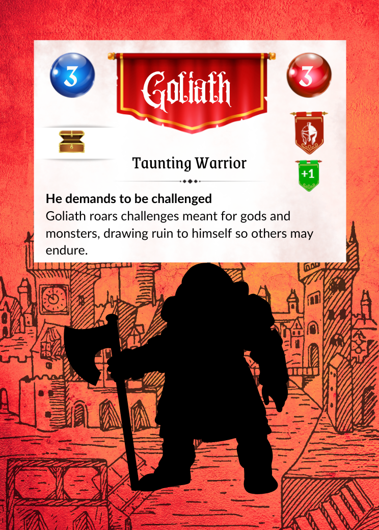
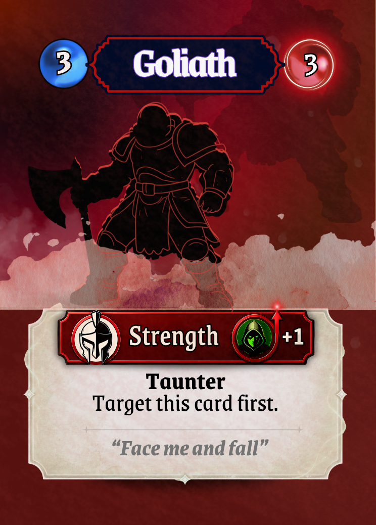
Before vs After – Surface and Depth - Goliath
The second prototype card shown here has very little depth, hard edges between sections, the UI is not well integrated. The
final version on the below shows the change:
Subtle texture and depth
Smooth transitions between elements
A unified surface that feels cohesive
The card now feels like a single object, not assembled parts.
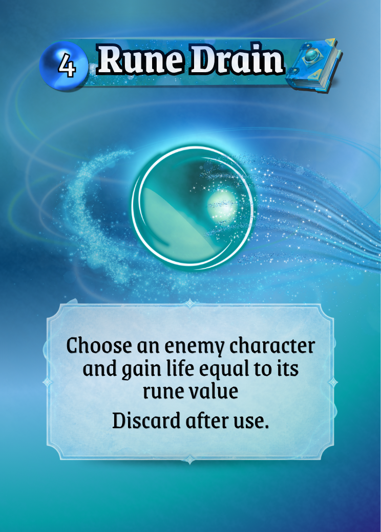
Defining a Visual Language
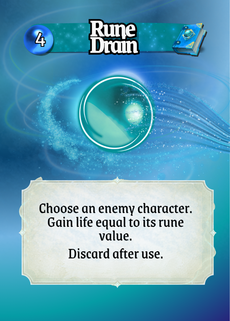
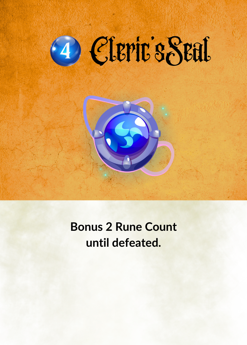
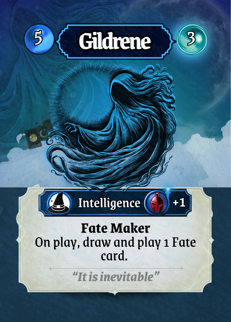
A major milestone in the process was establishing a clear visual identity for each card type.
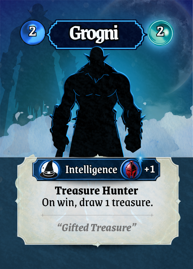
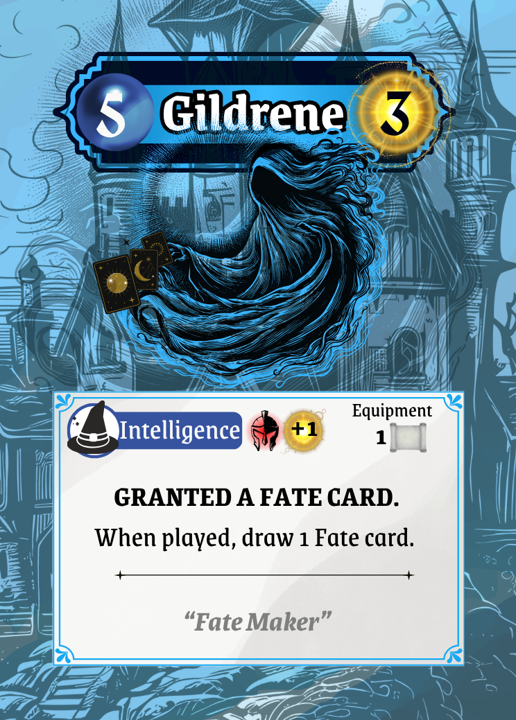
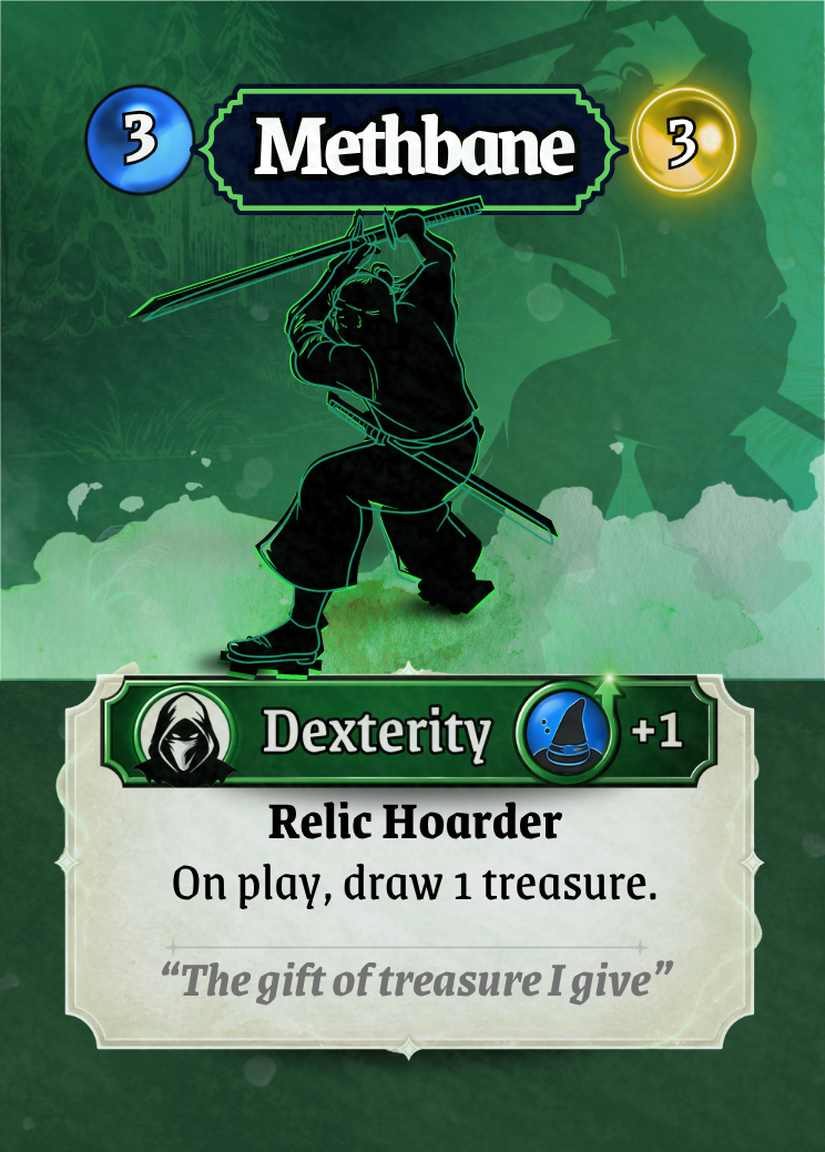
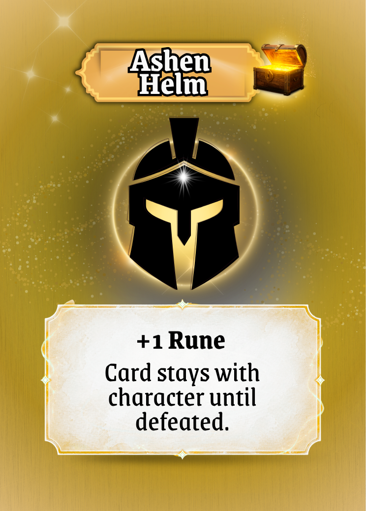
Character Cards feel grounded and structured
Spell Cards feel lighter and more magical, with subtle glow and energy
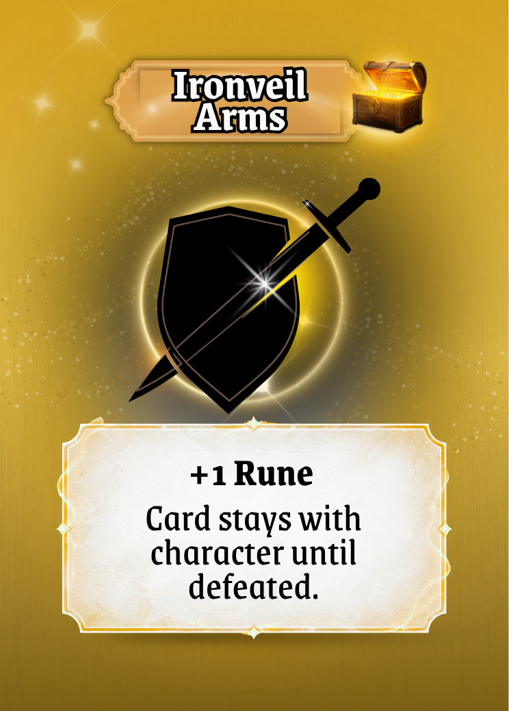
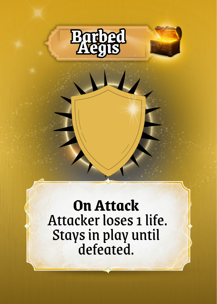
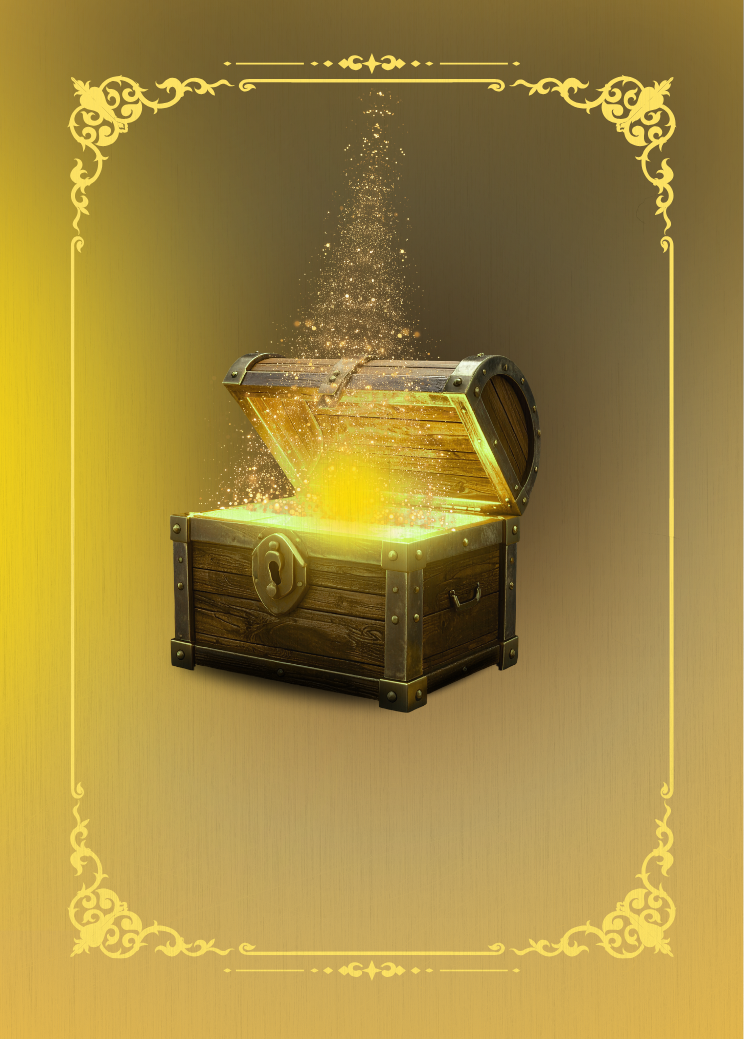
Treasure Cards have that look of winning something special.
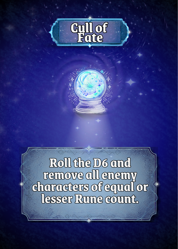
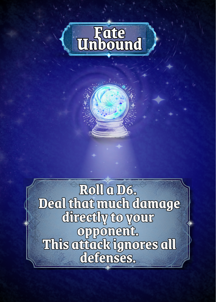
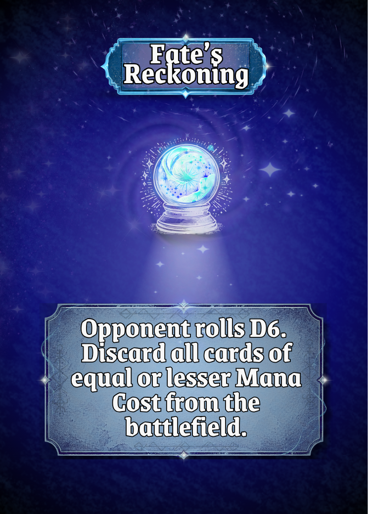
Fate Cards being darker and moody because let’s face it, these cards are not nice.
Icons and banners follow consistent rules across all cards
This creates instant recognition. Players don’t need to read to understand what they’re looking at they can feel it.
Before vs After – Card Identity
Before:
Card types felt visually similar
No strong distinction between mechanics
After:
Clear visual differences between card types
Immediate recognition of function and role
This is where the UI starts to support gameplay without needing explanation.
The Power of Subtlety
One of the most important lessons throughout this process was knowing when to stop.
Early iterations pushed too far:
Too much glow
Too much texture
Too many visual effects
There was way too much happening in the background.
Pulling these elements back created a cleaner, more confident design. If a player notices the effect instead of the information, it’s too strong.
The final cards aim for something quieter:
Effects that support, not dominate
Texture that is felt, not seen
Visual clarity over visual noise
From Prototype to Product
Looking at the final cards as a complete set, the difference is clear.
They are now:
Readable at a glance
Consistent across all archetypes
Visually aligned with the world of Dolven
Ready for playtesting, presentation, and production
Most importantly, they no longer feel like a prototype.
They feel like a product.


Final Takeaway
The biggest lesson from this process is simple:
Good UI design isn’t about adding more. It becomes about refining what’s there.
By focusing on clarity, consistency, and subtlety, the cards evolved from something functional into something intuitive.
And I hope that shift is what will bring the game to life for players.