5 UI Mistakes I Made Designing My First Card Game (and the Principles That Fixed Them)
When I first started designing the cards for Dolven: Runes Gambit, I assumed it would be straightforward.
We already had a digital version. The mechanics were designed, the cards existed, and everything worked on screen. I thought all I needed to do was translate that into a physical format, add some explanatory text, and call it done. How hard could it be?
At first glance, the cards looked great. They had detail, flavour, and all the information I thought players needed. But the moment I put them in front of people or even looked at them with fresh eyes…something felt off.
Early play tests saw players hesitating. They scanned the cards longer than they should have. They asked questions they shouldn’t need to ask. Important values were missed. Effects had to be re-read. That’s when it clicked. I had been naive to think a digital card game would translate directly into a physical one. On screen, the game does a lot of the work for you. It highlights, calculates, and guides the player. A physical card does none of that. The UI has to do all the workinstantly, and without explanation.
And I had made all the classic mistakes:
Too much text (and too small text)
No visual hierarchy
Important information buried
Too many decorative elements
I was designing cards to be looked at, not understood. So I started over. Stripping things back. Rebuilding. Testing. Failing again. Then tightening further. We reworked the cards several times, and through that process I learned a simple but hard truth:
If a player has to read your card to understand it, you failed.
This post breaks down the principles I learned while redesigning the UI for Dolven: Runes Gambit and how I moved from cluttered, confusing cards to something players can understand at a glance.
One of the biggest mistakes I made early on was treating every piece of information as equally important. The result was cluttered layouts, small text, and no clear visual hierarchy. When you looked at the card, it wasn’t obvious where your eye should go first. I had to stop trying to make everything stand out and start making the right things stand out. That became the real challenge and it’s what ultimately took the cards from prototype… to a finished product.
1. The First Glance Principle
When a player looks at a card for the first time, their brain asks three questions:
What is this?
Is it good or bad for me?
What do I do with it?
Your UI needs to answer all three at a glance. In Dolven, that meant:
The card type is immediately recognizable (Character, Spell, Treasure, Fate.)
The power/value stands out without searching
The effect or role is readable at a glance and not buried in text
If a player has to scan the whole card to understand it, the hierarchy is wrong. So I iterated the cards a number of times and I’ll show you the various iterations as we go.
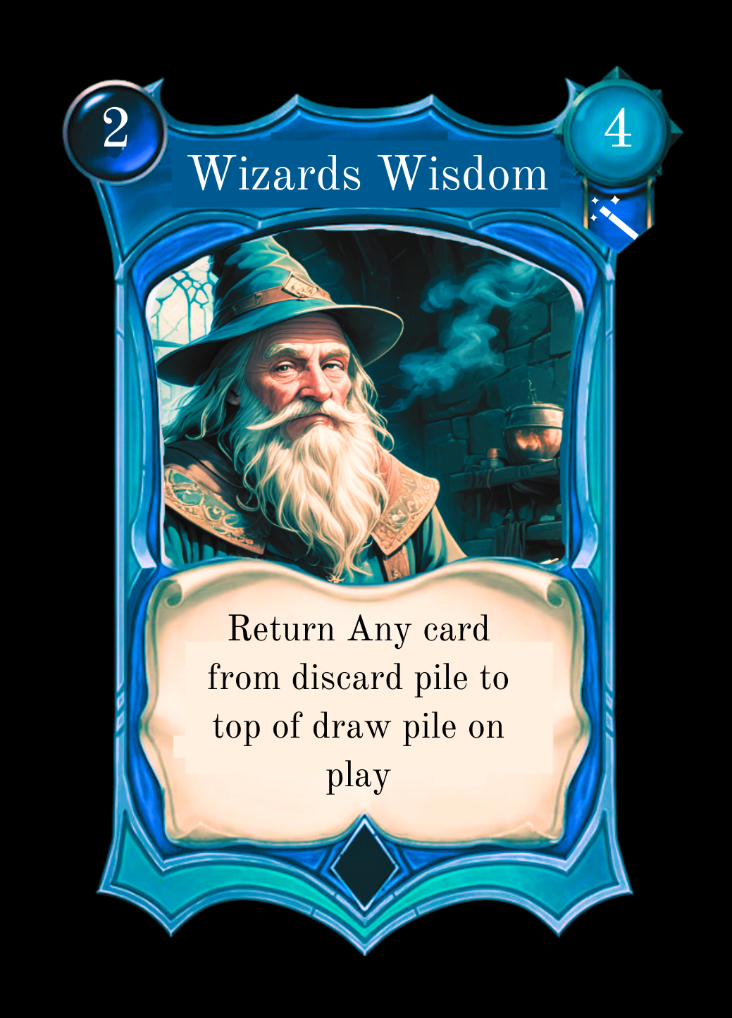
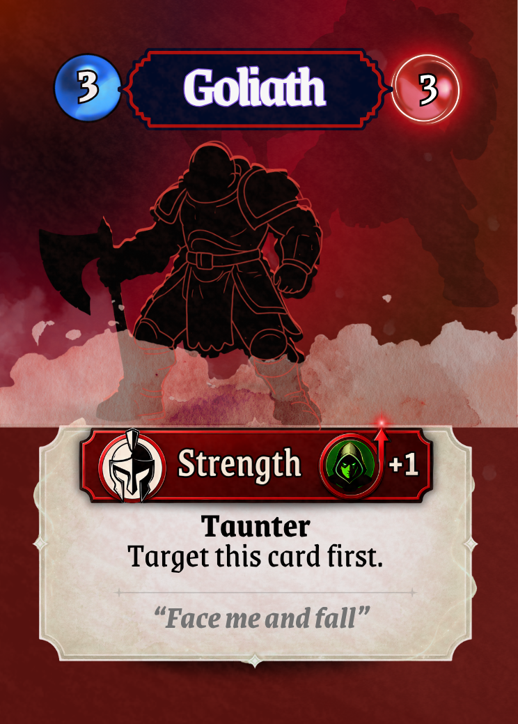
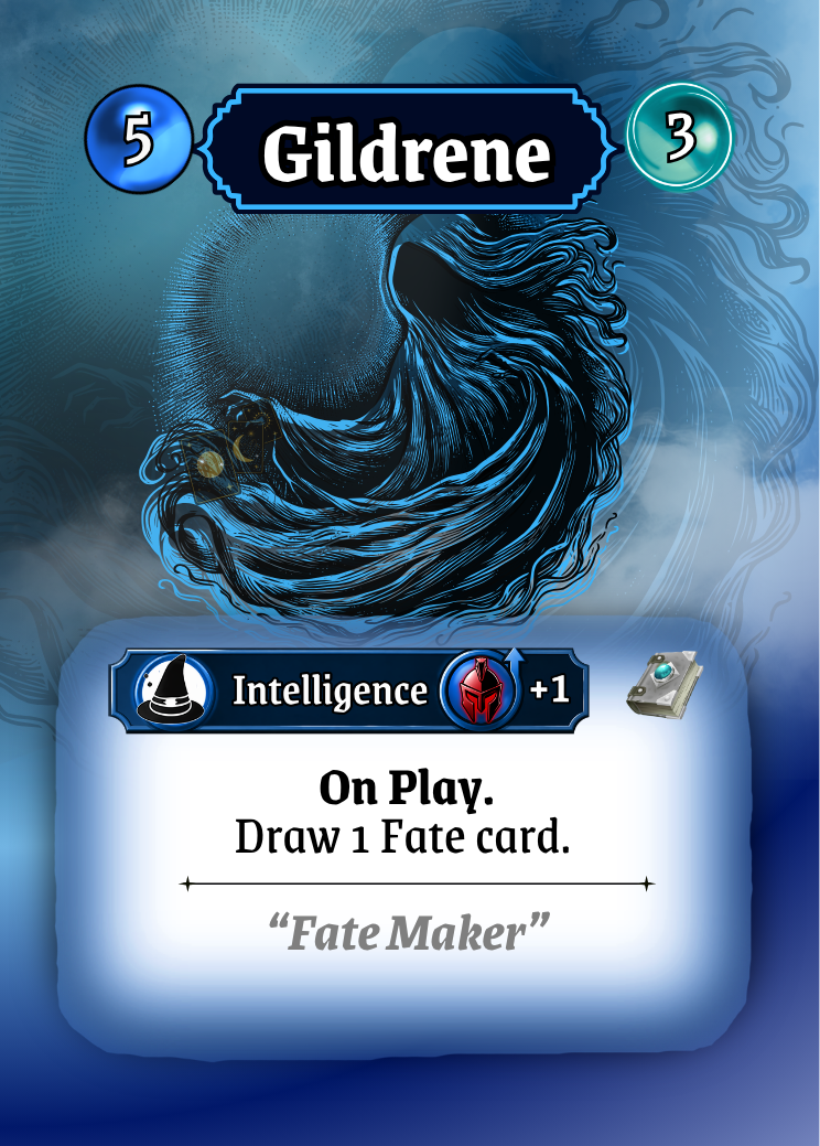
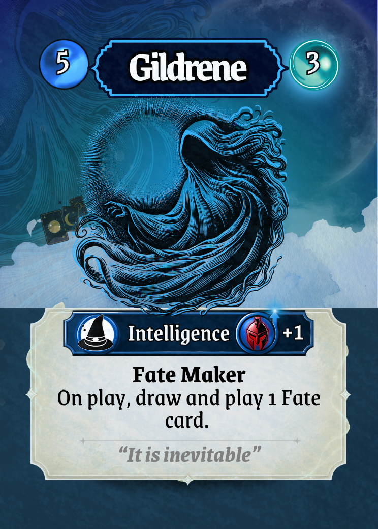
This is one of the first prototypes designed. At a glance, the card looks clean but struggles with clarity and focus. There is no real visual hierarchy which makes everything competes for attention instead of guiding the player’s eye. Key elements like the effect, values, and icons aren’t immediately understandable, which slows down decision-making. The iconography is also unclear and some hard to see, making it difficult to interpret what certain numbers or symbols represent without prior knowledge. It’s also too ornate. Ornate is pretty but not practical and the card design works great in the video game, but not as a physical card.
2. The Visual Hierarchy Principle
Not all information is equal and that needs to be reflected in your UI. I’m talking about ‘priority’ of information here.
In Dolven, players need to know the card type first, is it a spell or a character card. Then it’s rune value/power, how strong is the card. Then its archetype, is it a strength, dexterity or intelligence card. Secondly, an understanding of the effect of the card should be seen. Finally the supporting details of the flavor text, lore and any fine print. It took me a while to get that right.
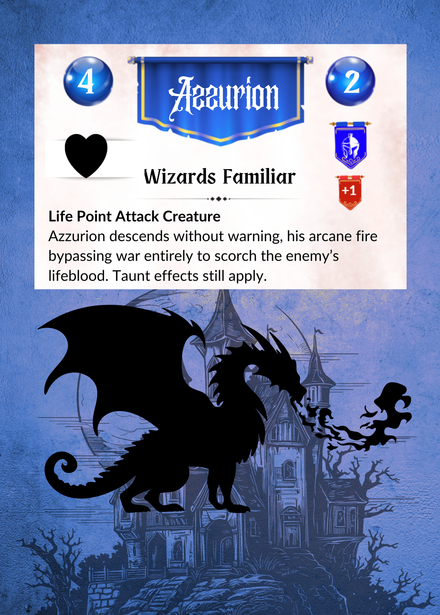
Below is an example of how I flunked the UI principles big time. From a UI clarity standpoint, there are some pretty fundamental issues with the Azzurion card on the left pictured below.
The Core Problem: No Clear Reading Path!
The card mechanics are buried in busy unclear UI, overly descriptive text that requires interpretation and there is no clear reading path.
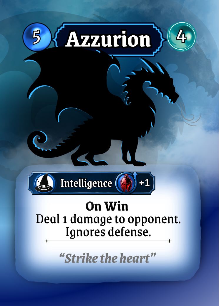
How I fixed it in the version on the right was by removing the clutter and replaced UI elements with a clear visual hierarchy and system language: “On Win” immediately signals the trigger, followed by a concise, structured effect (“Deal 1 damage… Ignores defense”). Key information is no longer buried it’s now surfaced.
The result is a card that doesn’t need to be read line-by-line; it can be understood at a glance because less is more.
3. Design for Recognition, Not Reading
Players don’t read cards mid-game. I should know this because I play card games and I never ‘really’ read the cards, I scan.
Most people recognize patterns so instead of relying heavily on text, we look for:
Icons
Color coding
Consistent placement
After a few matches, players shouldn’t need to read, they should be able to know what it means with a glance. That’s the goal.
4. Short is Sweet
Every extra element on a card costs the player mental energy. So, I had to really ask “Does this help the player make a decision right now?”
If the answer was no, it got cut or reduced. That meant:
Shortening effect text
Removing redundant labels
Avoiding decorative clutter that competes with gameplay info
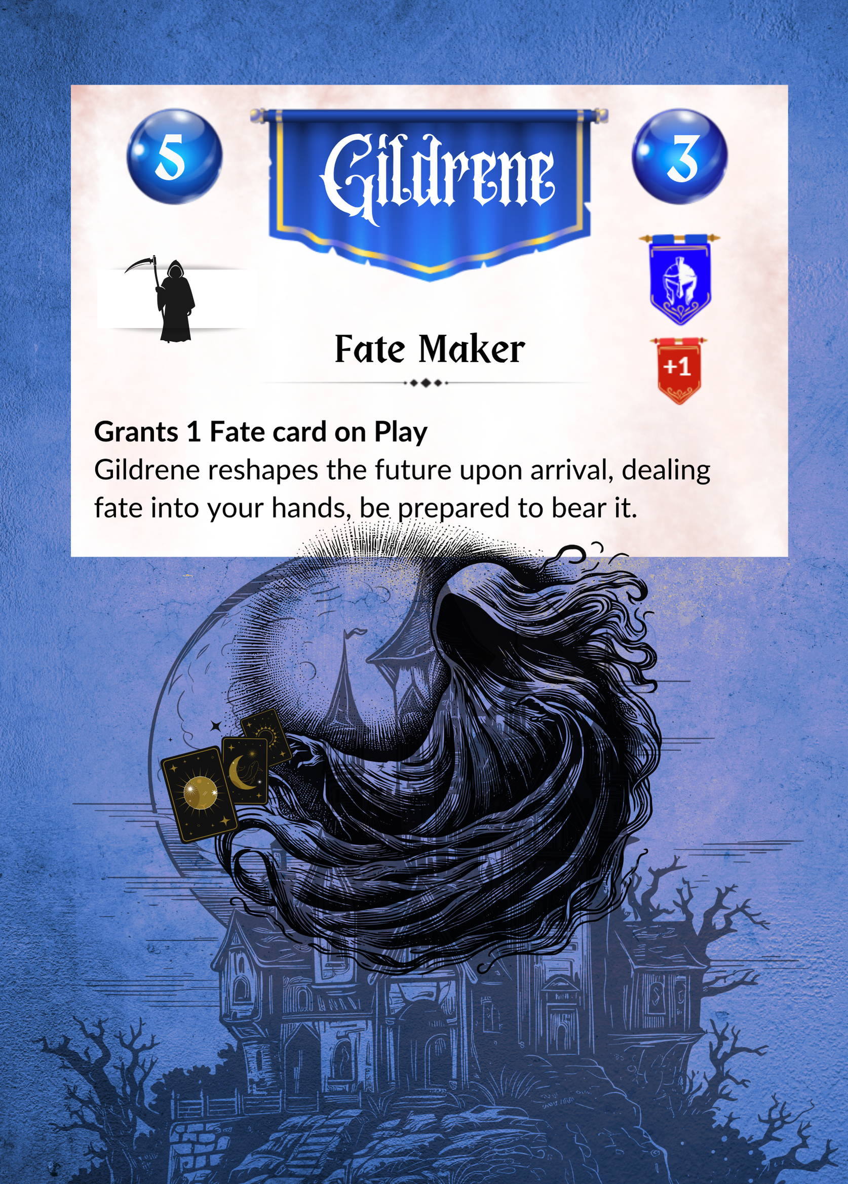
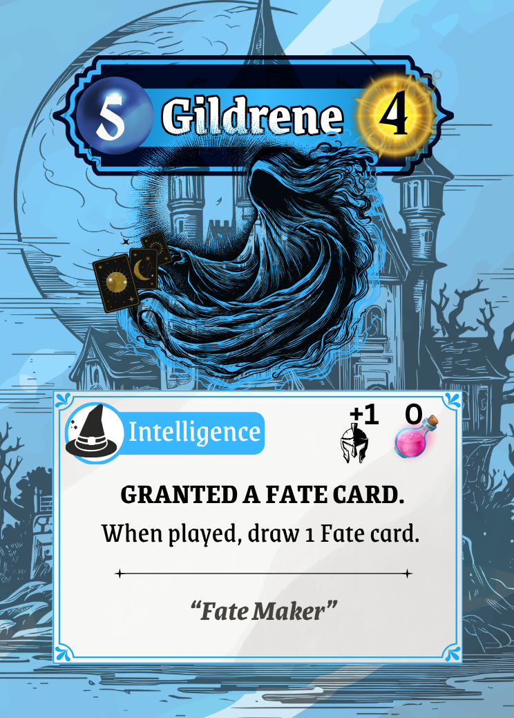
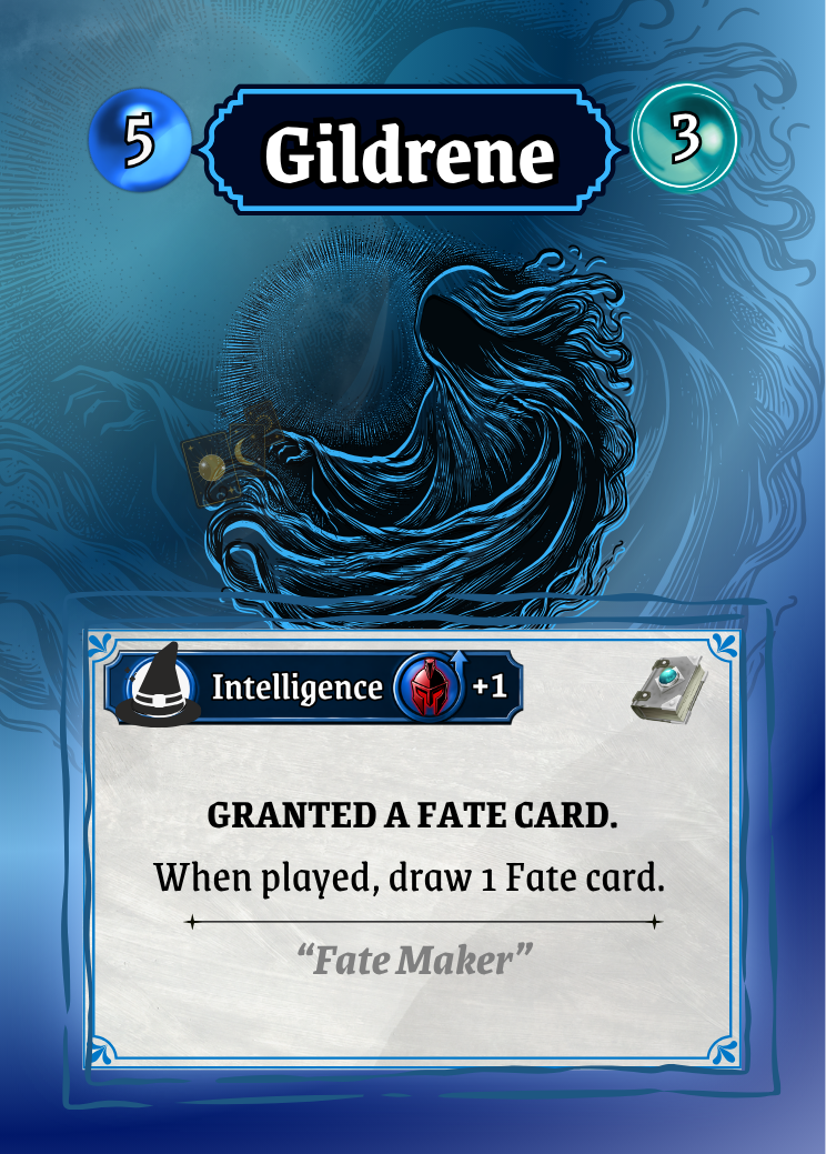
The Gildrene cards below show a slow progresion toward a cleaner UI that bring clarity and understanding without too much brain power.
I means, larger larger writing, less writing, succinct descriptions and it must hold your key elements in an order that is logical ie, card type , power/value and effect or role is readable instantly. This make perfect sense because when we play games, we often need to make quick decisions. The UI will either break your flow or make your flow.
5. Consistency Principle
Consistency is the principle that the same thing should always look, read, and behave the same way across every card. There was a reason why my cards were not consistent. This was partly because I started creating each card individually. Yes dumb, I know now, but when I first started I wasn’t a trained designer, I had never made a card game before so naturally, I didn’t know how to go about it structurally.
Consistency became easy when I learned that there is this amazing thing called a ‘template’ and I can actually reuse it over and over again. It took me a while to realise that, and when I did, it made the whole consistency principle so much easier. Sometimes I wish I would just read the manual before I start, but Alas, I am a creature of habit.
Using templates really helped turn my UI into a language…. it also saved a lot of time. So, remember the consistency principle and create one template that can be modified to help keep things consistent.
Designing the UI for Dolven: Runes Gambit has been an ongoing process over the past three years. Through countless playtests with a wide range of players, one simple truth became clear: Players don’t care how clever your system is, they care how quickly they can understand it. If there’s one goal to keep in mind, it’s this: make explanation unnecessary. When your cards communicate instantly, players feel smart. When they don’t, players feel frustrated and frustration is the fastest way to lose a player.
I’m proud to unveil the final version of Dolven: Runes Gambit. For those who may never have seen it before, is not just another card game, it’s a tactical battle of minds where every move shapes the outcome of the fight.
Decks will be available at upcoming events including AVCon and PAX, as well as online through our website.